![]()
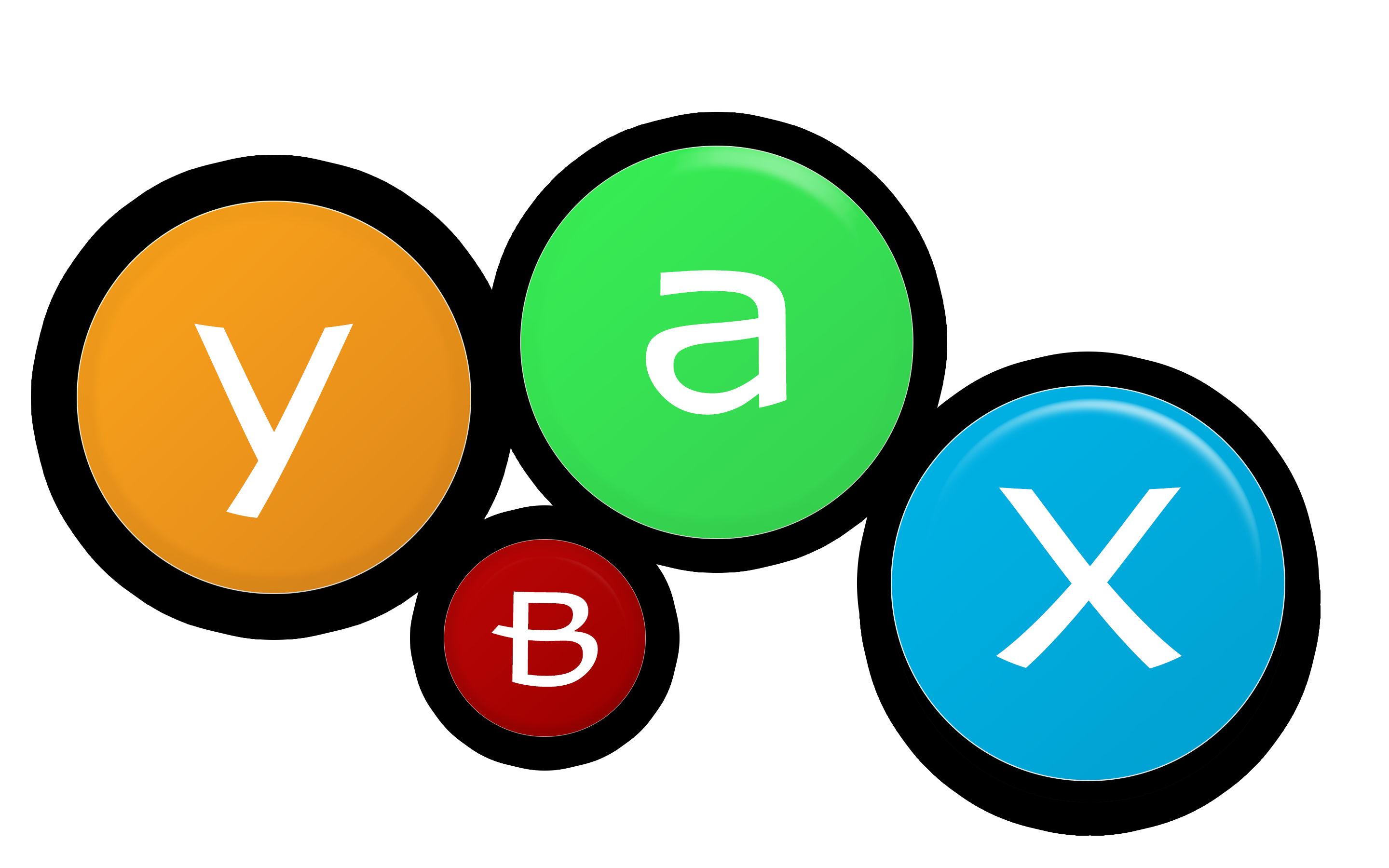
As I’m still setting up this site, I’ve quickly created this current placeholder logo to use as for now. It’s pretty simplistic with its main design point reflecting the Xbox controller colour schematics in a flat clean design.
Of course, as I’ve said this is still just a placeholder and once I’ve acquired some time I’ll add a few alterations to improve the logo as well as the rest of the website.
So what do you think? Leave any comments below of any opinions or perhaps even suggestions and how the future logo should appear as.
UPDATE #1: Well I’ve quickly refined the logo for it to look more suited in contrast with the blurred landscape header image with adding a sleek stroke design around the circles and resizing a few of the circles to create a sense of aesthetics for the design.